Homeassistant, InfluxDB 2.x and Grafana
I installed grafana the same way I installed InfluxDB (described in a post last year) via the ArchLinux package and activated the systemd service.
On first connection with default settings (browse to http://ip-address:3000) the login is admin/admin, but the password has to be changed on first login.
First the database connection.
I of course want to use the InfluxDB but I chose "Flux" as query system.
The only things in the dialog that needs to be filled in are the url: http://localhost:8086 and the InfluxDB Details.
To fill this we need the org, the bucket and a token. For this I used the influx-cli:
# get the orgs
influx orgs list

# get the buckets
influx bucket list

# create a readonly token for grafana
influx auth create --org hass --read-bucket 62302b4f139a4971 --description grafana-ro
Next is creating a dashboard with visualizations. The flux language is a bit strange and quite different from InfluxQL.
So we want to explore what data we have by activating the table view and for example list the possible measurements:
import "influxdata/influxdb/schema"
schema.measurements(bucket: "home_assistant")
A lot of sensors are stored by their meassurements, i.e. "°C", "%", others by their name, i.e. "binary_sensor.madflex_de" (uptime monitor), "weather.forecast_home" or "zone.home". For more exploration see here: https://docs.influxdata.com/influxdb/cloud/query-data/flux/explore-schema/.
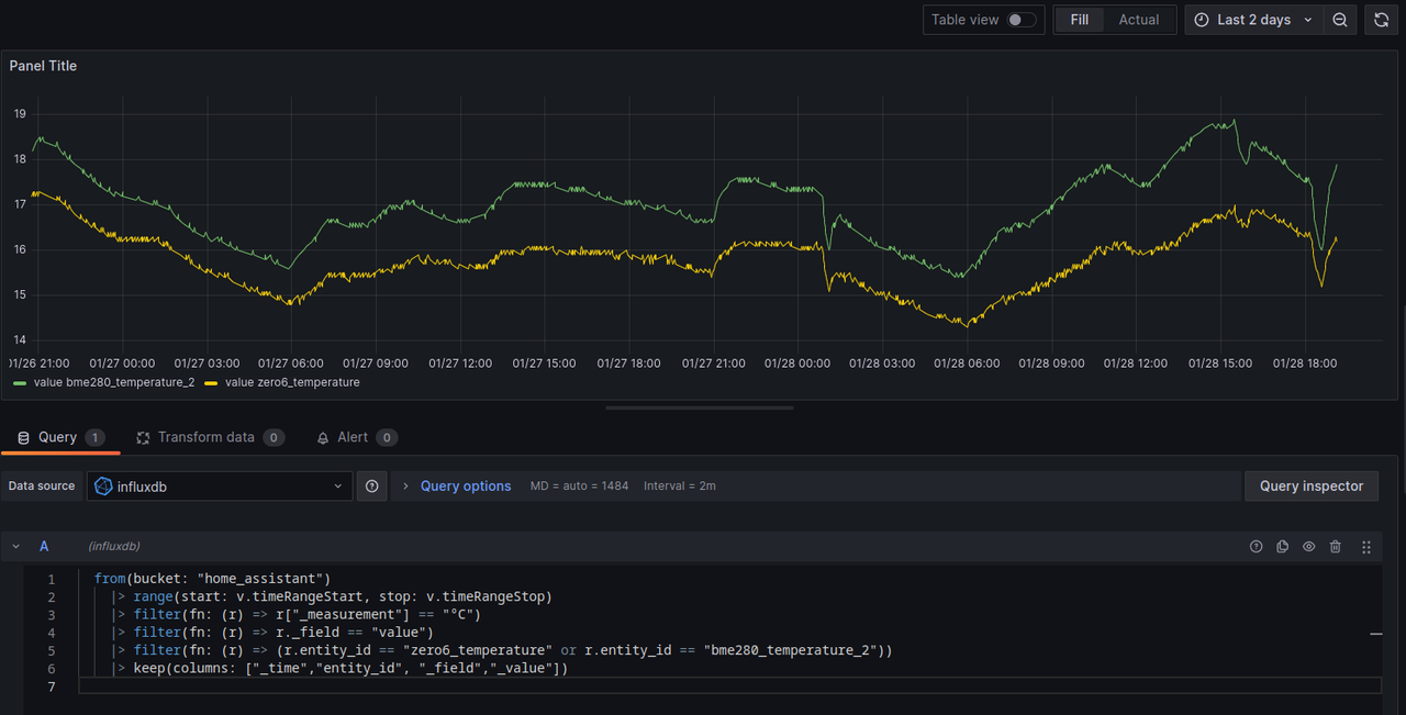
I deployed a second sensor in the kitchen that uses ESPHome, see previous blog post, and now I want to see how different they are. I assume a bit of difference because of the location but otherwise a similar curve. The code to see the temperature of sensors filtered by enitity_id and exactly the two sensors in the kitchen selected:
from(bucket: "home_assistant")
  |> range(start: v.timeRangeStart, stop: v.timeRangeStop)
  |> filter(fn: (r) => r["_measurement"] == "°C")
  |> filter(fn: (r) => r._field == "value")
  |> filter(fn: (r) => (r.entity_id == "zero6_temperature" or r.entity_id == "bme280_temperature_2"))
  |> keep(columns: ["_time","entity_id", "_field","_value"])
Another example is a graph for upload/download speed of the speedtest integration:
from(bucket: "home_assistant")
  |> range(start: v.timeRangeStart, stop: v.timeRangeStop)
  |> filter(fn: (r) => r["_measurement"] == "Mbit/s")
  |> filter(fn: (r) => r._field == "value")
  // add windowing
  |> window(every: 1d)
  |> mean()
  // duplicate _time so we can plot again
  |> duplicate(column: "_stop", as: "_time")
  |> keep(columns: ["_time","entity_id", "_field", "_value"])
The plot shows all speedtest data I have currently, with mean() value per day to remove the jitter in the very long timeframe.

And a third one, the status of a binary sensor -- choosing one that actually changes: binary_sensor.home_assistant_versions_update_available:
from(bucket: "home_assistant")
|> range(start: v.timeRangeStart, stop: v.timeRangeStop)
|> filter(fn: (r) => r["_measurement"] == "binary_sensor.home_assistant_versions_update_available")
|> filter(fn: (r) => r._field == "value")
|> keep(columns: ["_time","entity_id", "_field","_value"])
A timeseries plot didn't work here, but a barplot does:
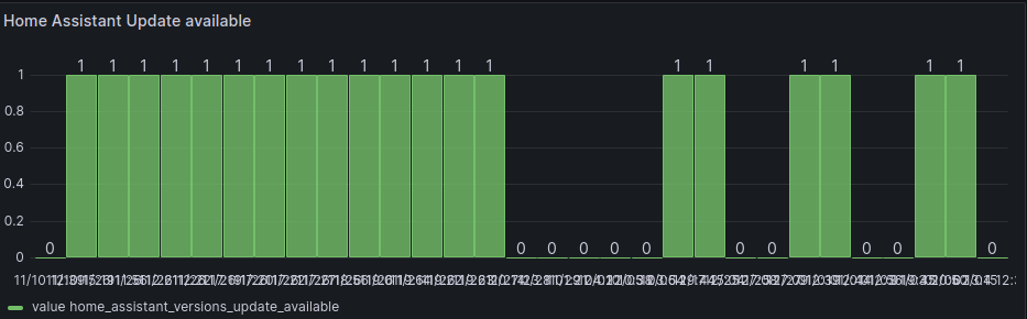
The value update_available seems to be pushed irregular, so this plot is probably not very helpful.
Overall Grafana is a cool addon to InfluxDB. The "new" InfluxDB query language Flux is very much noch SQL and I don't really like it. Probably because of my 25+ years of SQL experience.